1 Comment

Christin and Martin on an Alaskan Cruise

Christin and I took our first cruise June 22-29, 2018 departing from Seattle, WA going up the inside passage to Alaska. This was aboard the Ruby Princess, with about 3000 passengers and 1100 crew members.

Day 1: Seattle, Washington. After an early flight out from Detroit into Seattle, we made our way onto the ship for lunch and our first taste of the buffet. Quickly got a good sense that there would be too much good food to eat during the week. We spent the afternoon exploring. Having to remember that access to different floors could only be done through certain stairways and elevators was fun. We took advantage of being docked to play some ping-pong before the waves would make it tough to hit a straight shot.


Day 2: At Sea. All of day 2 was spent out at sea. The ocean wasn't too rough, but we were out of the secluded bays and harbours, you could feel the ship moving quite a bit. We took advantage of room service, and spent lots of time on the balcony. Christin was glad to have binoculars to do some early whale watching.

On our way to Juneau, along the inside passage


Day 3: Juneau, Alaska. We docked around 11am and quickly got off the ship to start our first excursion. Taking a small bus, we were taken to the docks to start our whale watching. With our great tour guides, we managed to come across humpback whales. These specific whales are regulars to the area, and this specific one was called Flame because of the markings on her fluke.

After a couple of hours out on the water, we made our way to Medenhall Glacier. This glacier is quite close to town. The hike to the glacier was easy enough with some nice views along the way. 


Day4: Skagway, Alaska. Overnight, the ship made further north to Skagway. We had booked an excursion here that would take us on a bus ride through the north edge of British Columbia, then into the Yukon. The tour guides focused on the history of the Klondike gold rush, how the White Pass was used, the railway that was built, and the changing landscape going up into the mountains. This was one of the nicest landscapes I've ever witnessed, only to be surpassed the next day.

Once we made it to the Yukon, we stopped in Carcross (Caribou Crossing) It was completely surreal to come across a large desert. We also saw some fun Alaskan puppies, and an alpaca. This was capped off with stop at Emerald Lake. The deep turquoise water spotted with dark blue areas was an incredible sight.


Day 5: Glacier Bay National Park, Alaska. This was my favourite day. We didn't go into port anywhere, we just slowly made our way through a few large bays that were dwarfed by mountains with glaciers in between. The temperature was 10C, but with only a few clouds it made for a great viewing experience. Waking up early in the morning, being surrounded on all sides by mountains, making our way to the Margerie Glacier. This became the highlight of the cruise. Our ship sat in front of this enormous glacier for 30 minutes that we enjoyed from our room balcony. Hearing, seeing, then feeling the enormous calving events, large chunks of the glacier falling off into the water was breathtaking. Then, when the ship turned around to give the other side a chance to see, we made our way to the upper decks to take in the awe inspiring sights.

Margerie Glacier - Advances up to 6 per day to fall into the water. The sediments it pulls down from the mountains cause the turquoise water of the bays.


Day 6: Ketchikan, Alaska. This was the only day that was completely overcast, with a bit of light rain here and there. We didn't book any excursions for this stop. Instead, we opted to walk around the town, then go out for a hike into the Alaskan rain forest. This was a great hike up into the mountain along the coastal waters, with views of the other surrounding islands. This was capped off seeing redwood trees for my first time. It's incredible the size of these trees.


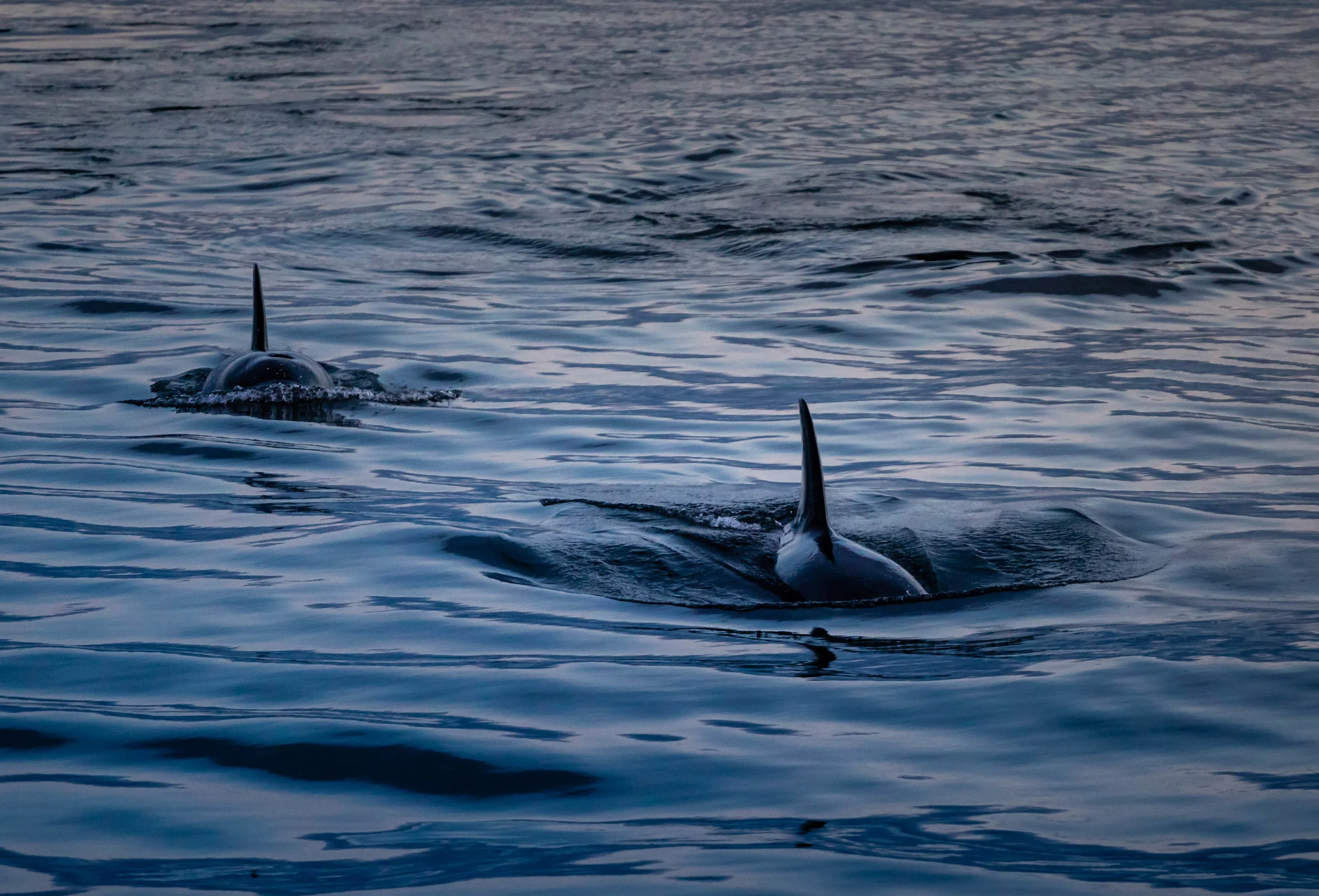
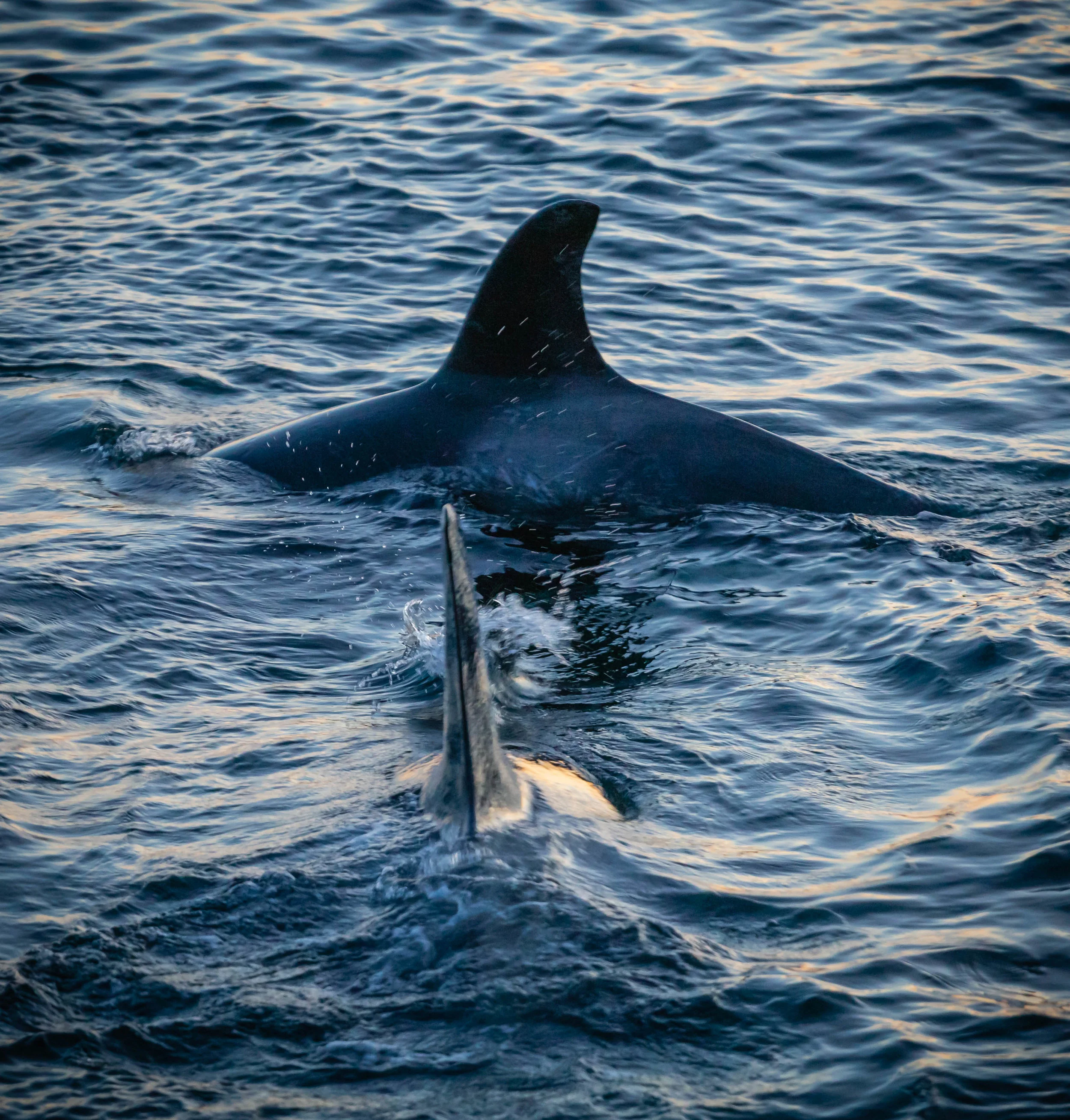
Day 7: Victoria, British Columbia. Though since we only arrived at port here at 7pm, most of the day was at sea. We did another whale watching excursion that gave us a chance to see orcas up close during sunset. Nothing much could have been a better to cap off this cruise. Though it took a while to get out to the islands where they were hunting, it was more than worthwhile. We parked our small boat near Stuart Island right along the Canadian/American border when a pod of 6 orcas that hunt small sea mammals decided to have a bit of social fun swimming around and under our boat. It wasn't until after I went through my pictures did I notice that they were successful in their hunt that night.


Day 8: Seattle, Washington. Arrival back at port. A bit of a rushed morning to disembark, but easily made our way to our great AirBnB apartment in downtown Seattle to spend the next 3 days. We loved our time in Seattle, walking all over, getting a taste of so many good local bakeries, restaurants and bars. Seattle has become our favourite city and would be a fantastic place to have another extended stay at.

1 Comment

Completed Course: Supply Chain Fundamentals

1 Comment

Completed Course: Supply Chain Fundamentals

I'll be posting my completed courses here. I've gone through quite a few in the last couple of years. I'll start posting my thoughts about the courses and the material. I'm hoping by going back through them again it'll help to cement what I've learned.

This should also serve as a bit of a review of each one as well. These are all edX courses. I have previously done a few courses from Udacity and one from Coursera. At this point both of those sites have added and changed quite a bit so there's not much I can comment on anymore. When edX along with MIT released their pilot program of a possible blended Masters program I was excited. They were offering five online courses that would then allow you to apply to their school and complete a Masters with only one extra semester. So I jumped into trying the Supply Chain Management MicroMasters.

The first course in the program was Supply Chain Fundamentals.

This course is a survey of the fundamental analytic tools, approaches, and techniques used in the design and operation of logistics systems and integrated supply chains. The material is taught from a managerial perspective, with an emphasis on where and how specific tools can be used to improve the overall performance and reduce the total cost of a supply chain. We place a strong emphasis on the development and use of fundamental models to illustrate the underlying concepts involved in both intra- and inter-company logistics operations.

The three main topic areas we will focus on are: Demand Forecasting, Inventory Management,
and Transportation Planning. While our main objective is to develop and use models to help us
analyze these situations, we will make heavy use of examples from industry to provide
illustrations of the concepts in practice. This is neither a purely theoretical nor a case study
course, but rather an analytical course that addresses real problems found in practice.
— https://www.edx.org/course/supply-chain-fundamentals-mitx-ctl-sc1x-2#!

Overview of topics that were learned

  • Demand forecasting: Types, limitations, uses;
  • Forecasting metrics: MD, MAD, MSE, RMSE, MPE, MAPE;
  • Time Series Analysis: Cumulative, Naive, Moving Average, Level, Trend, Seasonal;
  • Exponential Smooth: Simple, Level & Trend, Damped trend model, Mean square error estimate;
  • Exponential Smoothing with Holt-Winter: Simple, Holt Model, Seasonality, Double exponential, Normalizing seasonality indices;
  • Forecasting using causal analysis: Ordinary least squares linear regression, Model validation, Multiple linear regression, Coefficient of determination, Adjust R^2;
  • Forecasting for special cases: Analogous forecasting, New-to-world products (Bass Diffusion model), Intermittent demand (Croston's method);
  • Inventory Management: Holding inventory, Inventory classification, Relevant Costs;
  • Economic Order Quantity (EOQ): EOQ Model, Optimal order quantity, Optimal time between replenishments, Sensitivity analysis;
  • Economic order quantity extensions: Average pipeline inventory, discounts, Finite replenishment;
  • Single period inventory models: Marginal analysis, EOQ with planned back-orders, News-vendor model, Profit maximization, Expected profits with salvage and penalty, Expected units short;
  • Probabilistic inventory models: Base stock policy, Continuous review policies, Level of service metrics, Cycle service level, Cost per stock out event, Item fill rate, Cost per item short, Inventory performance metrics, Safety stock logic, Periodic review policy;
  • Inventory models for multiple items and locations: Aggregation methods, Exchange curves, Cycle stock, safety stock, Power of two formula, Pooled inventory;
  • Inventory models for class A and C items: Management by segment, Policies, Disposing of excess inventory;
  • Fundamentals of Freight Transportation: Trade-offs between cost and service, Packaging, Transportation networks;
  • Lead time variability & mode selection: Impact on inventory, Transportation cost functions, Lead/Transit time reliability;
  • One to many distribution: Distribution methods, One to many systems, distance estimation, Estimating tour distance;

1 Comment

1 Comment

Chatham-Kent 2014 Mayoral Election Results Analysis. Or "how to make municipal elections fun!"

This is going back to last year’s election for Mayor of Chatham-Kent, Ontario, Canada. Chatham-Kent is a bit different than many places. The municipality is considered the entire county. Below is the map and legend outlining the municipality.

Here are the results of the election. Mayor Randy Hope was re-elected with 31.3% of the votes.

There are couple of different ways I wanted to look into the election. You can see that Mayor Hope had the most votes in all 6 Wards. Though First Past the Post as a voting system has its own issues, there’s really not much I can do to look at how differently the outcome might have been with a different one.

Below, I focused on how all the candidates performed in each ward against their average result. The average of each candidate for each ward was compared to the average without the ward of comparison. This prevents the comparison you’re trying to make from affecting itself.

You can quickly pull from this table that Mayor Hope outperformed in Ward 1.

His biggest competitor was Crew. Some pretty close results.

In every Ward, he carried the popular vote. Though, certainly not by large margins except for the 1st Ward. With the winner selected, let’s jump into looking at how Mayor Hope won. Here are the results by division.

It jumps out the Ward 1 was where he did the best. For the most part, he was otherwise pretty consistent across all other Wards.

And here it is actually mapped out. The darker the area, the higher percentage of the vote that he got.

And now zooming into the highest population center, Ward 6, the town of Chatham.

Again, darker is more votes. It’s interesting to which neighbourhoods had the highest support for the re—election of Mayor Hope.

And finally a look at voting results between 2010 and 2014. Mayor Hope finished with a higher percentage of the votes in 2010. This was partly due to 1 less candidate, but there also seems to be a greater split of votes between candidates and more viable candidates in 2014.

As you can see, Mayor Hope took a smaller percentage of the vote in 2014 compared to 2010 in all but 1 Ward.

The data for the elections was taken here. Maps and charts were created by me in R and excel.

1 Comment

Comment

Mapping Trees in Toronto with R

Toronto Tree Mapping

There isn’t too much analysis for this post. It’s mostly a walk-through of the project that I did. The end result is interesting to look at, but I haven’t figured what to do with the visualisation. Coincidentally, there was a paper published to Nature a couple of weeks ago that used the same dataset to do some actual science. Chris Mooney at the Washington Post does a good job of summarizing the findings.
Since the dataset is so large, over 530,000 trees are mapped within just the City of Toronto; I’ve trimmed the map to only account for the 9 most common types of trees. 1 This left 206,756 trees that could be mapped out.

Norway Maple, 75,070 -- Crab Apple, 24,033 -- Colorado Blue Spruce, 22,512 -- Silver Maple, 20,633 -- Honey Locust, 18,837 -- Schwedler Norway Maple, 15,642 -- Littleleaf Linden, 13,890

All the work I’ve done here has been in an effort to teach myself how to do it. You’ll notice a few instances where I don’t know exactly why a specific piece of code is needed. As time goes on, I’m hoping to be able to answer my own questions. For now, I think it’s a great exercise to try to document what I’m learning. There were a couple of sites that helped me to put it all together. I went through the tutorials on both sites and used them as guides to help me create this.

Spatial Data ggplot2

Maps in R

I’ll start with the data source. I searched for data about Toronto and came across it. I recognized the WGS84 version of the data and hoped that it would match what I did in the tutorials. The City site seems to have quite a few more data sets that should be provide some a good source for analysis in the future.

These are the libraries I used:

library("rgdal")
library("ggplot2")
library("rgeos")
library("plyr")
library("ggmap")
library("RColorBrewer")
library("grid")

First, setting the working directory where I previously downloaded the files. Then, I used the readOGR function to read the WGS84 files. This actually takes a little bit of time to read. The data is saved to trees.

setwd("c:/coding/R/Toronto")
trees <- readOGR(dsn = ".", "street_tree_general_data_wgs84")

This next part is still something I’m trying to understand. Using the Spatial Reference website, I found the proper ESPG code for Toronto. I need to figure out why it’s needed and not already built in.

proj4string(trees) <- CRS("+init=epsg:3348")

Here I’m converting the data into a data frame for manipulation. Then creating a count of the number of each type of tree so that I can subset the data.

trees_df <- as.data.frame(trees)
tt <- table(trees$COMMON_NAM)
ComTrees <- subset(trees_df, trees_df$COMMON_NAM %in% names(tt[tt > 12000]))

A quick change to the column headers to make them easier to read/handle.

names(ComTrees)[9] <- "long"
names(ComTrees)[10] <- "lat"

This part here is done just to check how the data points are being laid out. Not actually overlaying on top of the map yet. But it’s pretty interesting being able to pick out the shape of the city along with some of the landmarks just from this. Following the code…
“ggplot(ComTrees”, calls up up the ggplot function and uses the ComTrees data.
“aes(…)” function is the aesthetics. It passes along the x axis and y axis data, then the separation of color by the COMMON_NAM.
“geom_point(size = 0.01)” is the scatter plot layer that’s added with the size of each point.
“coord_equal()” function is how the projection of latitude and longitude should be scaled.
“scale_colour_brewer(type = "qual", palette = 1)” indicates what colour palette should be used.
Some of these functions will be repeated for the final code of layering the scatter plot of trees onto the map.

Map <- ggplot(ComTrees, aes(long, lat, color = COMMON_NAM), group = group) + 
  geom_point(size = 0.01) + coord_equal() + scale_colour_brewer(type = "qual", palette = 1)
Map

Now I had to pull in the coordinates boundaries of the data. I don’t think this is the cleanest way of doing it, but it worked right away so didn’t spend a lot of time looking into it. There’s a small added amount to the max and min latitudes and longitudes so that all the data points fall inside the map. I’d still like to understand the bbox function better to figure out why I couldn’t get it to work with the ComTrees dataframe.

b <- bbox(trees)
b[1, ] <- (b[1, ] - mean(b[1, ])) * 1.05 + mean(b[1, ])
b[2, ] <- (b[2, ] - mean(b[2, ])) * 1.05 + mean(b[2, ])

A quick change to row names in b to make it easier to follow.

row.names(b)[1] <- "lat" 
row.names(b)[2] <- "long" 

Now here’s the big chunk of code that will get most of our work done. I’ll try to break down each part of the function as best as I understand it. “get_map(location = b)” This passes the coordinates to the get_map function that pulls in the proper map from Google Maps. There are other providers that can be used.

“ggmap(Tor.b1, extent = "panel", maprange = FALSE)” : I honestly don’t know why I had to specify the extent and maprange, but at it worked. This function just grabs the map that was previously pulled from Google Maps.
“%+% ComTrees”: Here we add in the data for the trees. For R, %+% is a continuation of code, but this is something I have to look into more.
“aes(x = long, y = lat, color = COMMON_NAM) “: Just a repeat of the geom_point chart done previously, but wanted redo it for this chunk of code. Again, pulling in the longitude and latitude data for the x and y axis, while the dots are separated by their Common Name.
“geom_point(size = 0.01) + scale_colour_brewer(palette = "Set1") + coord_equal()”: All the same as above, but wanted to replicate, I could have done it as a repeating layer, but as I was doing lots of tweaking to see the different options, it was easier to have a single piece of code to rerun everytime.
Tor.b1 <- get_map(location = b) 

Tor.Map <- ggmap(Tor.b1, extent = "panel", maprange = FALSE) %+% ComTrees + aes(x = long, y = lat, color = COMMON_NAM) +
  geom_point(size = 0.01) + scale_colour_brewer(palette = "Set1") + theme_opts + coord_equal()

  1. I set the minimum to a 12,000 count of a tree, and 9 types were left. There were a total of 225 types of trees.

Comment

1 Comment

Optimize CPP Withdrawals

Optimize CPP Withdrawals

Retirement planning is an important process. In Canada one of the components of this plan is the Canadian Pension Plan (CPP). Payment amounts are determined by the amount contributed towards the fund between the ages of 18 and 65. The lowest 8 years of earnings are dropped. You contribute 4.95% of gross salary up to a max that increases with cost of living.

For those approaching the age of 60 and retirement, a decision will have to be made when to elect to receive your eligible benefits. Age 65 is considered to base amount with each month earlier reducing payments by 0.006%. While delaying to elect CPP increases payments by 0.007% per month. 1

Not everyone will be in a position to try to optimize when to begin CPP benefits. If your retirement requires your CPP benefits to sustain itself, there isn’t a point in trying to get the most out of it. Just take the money. If the flexibility exists, it’s an interesting exercise to figure at what point you could optimize your benefits. 1

There multiple factors that need to be taken into account to make the decision on when to elect starting your payments. Start with your life expectancy. This can get very detailed but a simple range is probably good enough. Then you need to factor in your time value of money. A discount rate is used and shown below are the five different real rates of return. (Rate of return after taking inflation into account).

Your decision will then come down to how long you expect to live and what you’ll do with the money. If you intent to invest your payments on a regular basis in conservative assets that would just match inflation the 0% line would be your starting point. (An inflation amount of 2% was assumed, though it won’t have an impact for this exercise. Conversely, if you intend the just spend the money right away, then your time value of money would be different. You’re real discount rate is then -2%.

A different way of looking at it that is tougher to quantify is how much you value money now versus how much you’ll value it in the future. This would be the case where you would get more enjoyment from travel while you’re a healthy, vigorous 60 year old, versus the risk of not being able to use it in the future.

Retirement planning does have many components. This is one that you’ll have to think about and decide for yourself which is best. 


  1. To use chart, select your life expectancy at bottom, then follow it up until you hit your selected time value of money. Look to the left axis to determine the optimal age to elect CPP.

  2. Assumption of 2% inflation was used.

1 Comment